Left Main REI Rebranding
A successful startup often outgrows its initial branding. Left Main came to me with the exact problem; to upgrade their branding to more accurately represent the company’s revolutionary all-in-one SaaS B2B real estate CRM on Salesforce platform. Left Main is known for its product with robust customization, friendly and knowledgeable customer support, and for the charismatic founder, Stephanie Betters.

[Before on the left, after on the right]
My first assignment was to revamp the look-and-feel of their social posts, but I felt like the logo needed some updating, too. I kept the iconic door with the number 18 as the base, zoomed it in so it reads better, and gave it more modern typography.

Then I created the secondary graphic that features their iconic “Door” from the logo, and its shape to compose cloud-like figures to echo their platform, Salesforce, logo.
These cloud graphics are set to be flexible to support the branding throughout various applications.
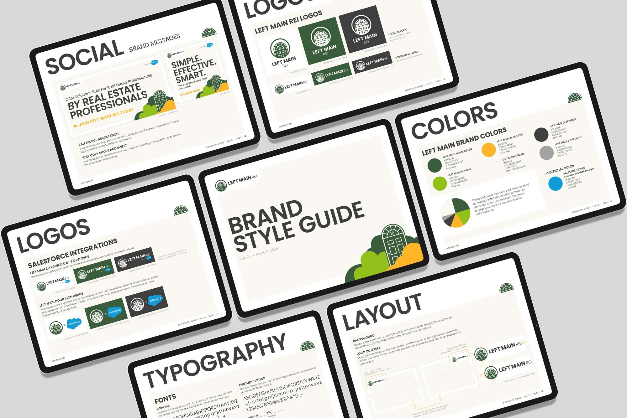
Then I provided Brand Style Guide before rebranding the actual brand collateral.
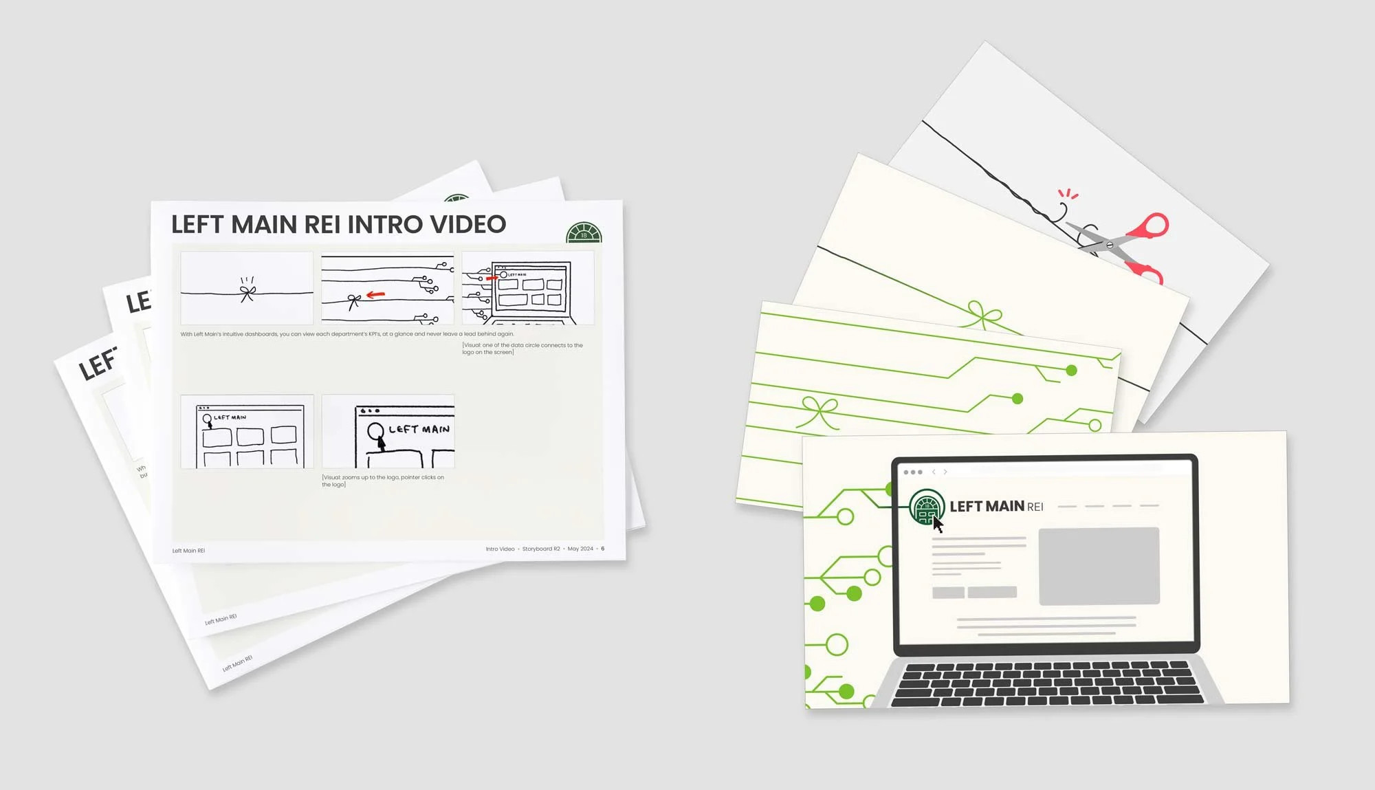
I worked with a motion designer to create a short video for the website. My role included storyboarding and providing the graphics for the motion designer. The approved version of the video can be watched here.
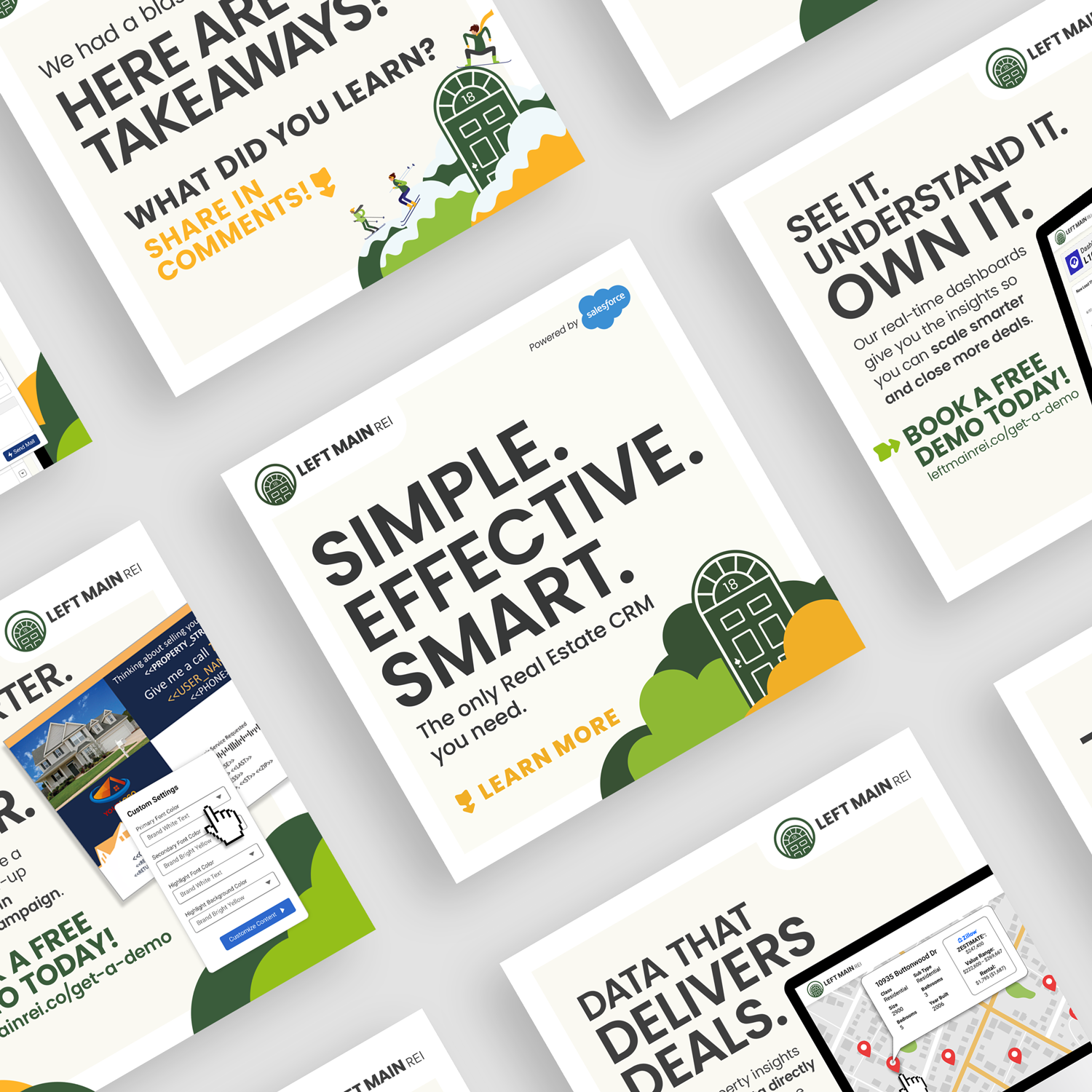
Over the past year, the new brand look carried on, and the brand recognition went up. The marketing team achieved 25% increase in engaged sessions, as well as 17% jump in active uses and 15% in new users in one campaign.
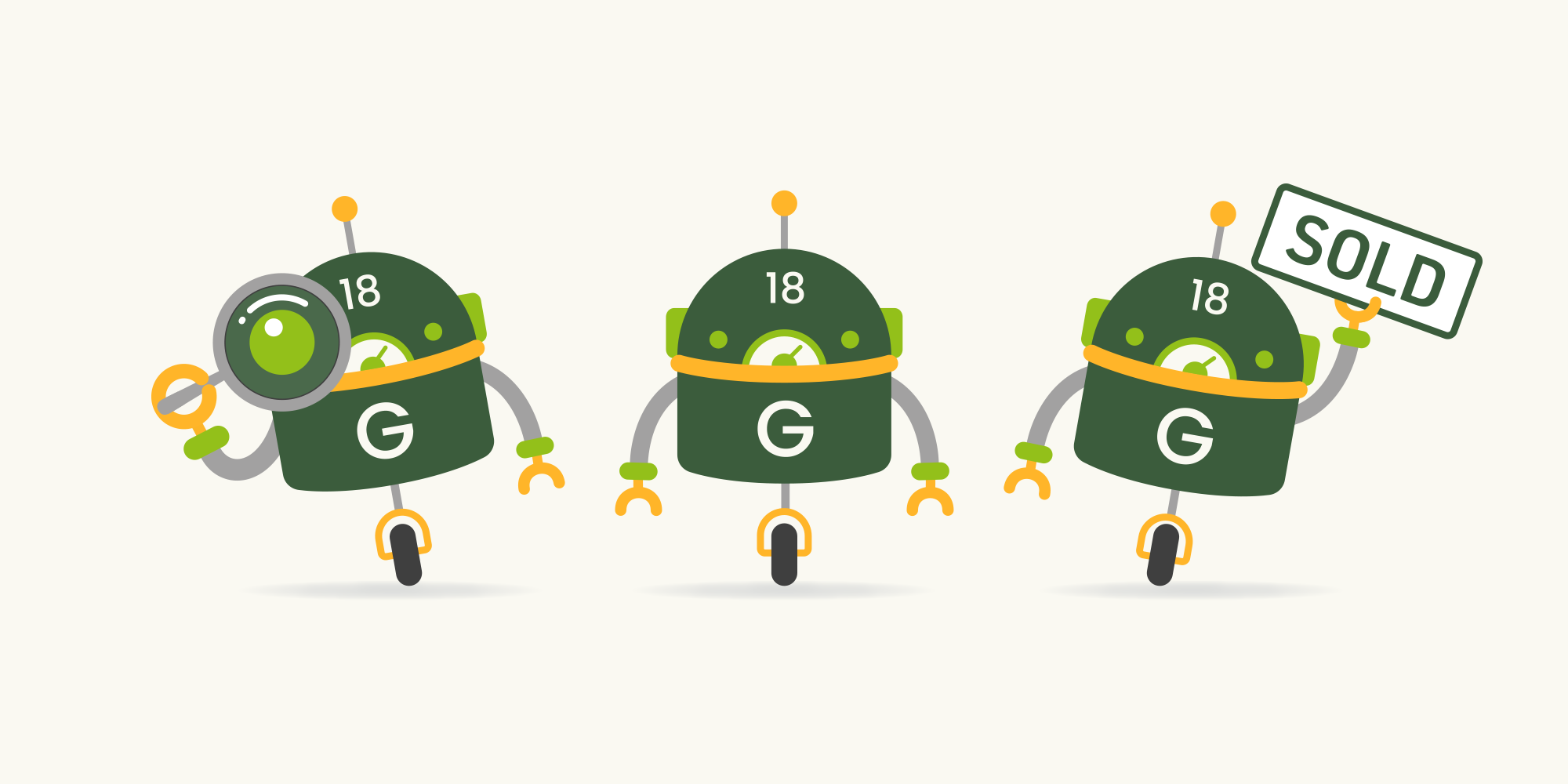
I created above mascot, Left Main Genius, for their Artificial Intelligent features. This character appears in variety of applications including web, social, and videos.
Shown on the left: some samples of sub-brand logos and icons that have been developed.
Some sample icons I designed for website, sub-brand, and UI for the CRM.